Friday 21 November 2014

IndigoBlu Challenge Blog Let It Snow

I was dead chuffed last month to find that random org had chosen me as the winner of the sketch challenge at IndigoBlu Challenge Blog.  As well as winning my choice of 2 large stamp plates I was asked if I would like to submit a card for their next challenge, which is Let It Snow.

Bit of a challenge as I don't own many IndigoBlu stamps (yet) and I didn't have any to really get into a scene building theme so I had a play around with Frosted Baubles and Seasons Greetings.
I've used the sentiment set loads of times as it fits in with contemporary and vintage themes but had yet to ink up Frosted Baubles.

I started with a 5 1/2inch square of white cardstock and stamped Frosted Baubles in the corner using versamark then heat embossed some WOW clear holographic embossing powder.  I then used stormy sky, faded jeans and dusty concord distress inks to build up a dark layer of blended ink before gently buffing some paper towel over the embossed area to bring back the white pattern, which thanks to the EP  has a pale purple tone when caught in the light.  To add a snowy look I gently misted with water from a spray bottle and left to dry.  My spray bottle gave quite a fine mist which softened the background rather than gave a full on snowy effect so I dabbed some silver adirondack dauber onto my craft mat before adding a drop of water, mixing with a fine paintbrush then tapping the paintbrush mid air over the card to give a splatter effect.

While the silver paint was drying I used the same clear holographic embossing powder to stamp & heat emboss a sentiment from Seasons Greetings on to an offcut of the white card before diecutting with a Spellbinders circle die.  This was inked with primarily stormy sky before the edges were inked with dusty concord to add just a hint of a faux layer before being buffed with paper towel.

Once dry the card was trimmed slightly to hide that it wasn't stamped at perfect right angles in the corner before being matted on some silver holographic mirri card.  I added a piece of stampinup ribbon and mounted both layers on to a white not quite 6*6 card.   I then diecut a slightly larger spellbinder circle die using offcuts from the mirri and matted the sentiment with foam pads. To finish off I added a few purple pearls to the sentiment panel and to the top corner.


Friday 7 November 2014

Brusho mop ups meets Jofy

Been a week for birthday cards, it was one of my BFFs birthday yesterday and I made this one for her.

Nowt really but a lot of white card!  Started off stamping and masking the scene using archival ink and white cardstock before hitting it with various blue & purple distress inks to give a graduated sky, and a teeny bit of green along the base.  Once I was happy with the ink blend I matted and layered onto some silver holographic mirri and a white a5 card base and left to one side.  Using various pieces of brusho mop up card, a piece of the brusho marbled from a couple of months ago and some fresh sprinkle and sprayed pieces I went about stamping and fussy cutting each and every single bit of the flowers before tipping the edges with a complimentary felt tip marker.  Once I was happy with the pieces they were carefully stuck in to place and some were subtly glittered and sparkled with a clear wink of stella brush pen and the Happy is glossy accented.  I was quite chuffed with the finished card & Tracy seemed to like it, didn't tell her it was brushos cuz she's not that stuck on em lol.   For something that to an untrained eye it looks deceptively simple but in reality took ages with all that fussy cutting.


That'll teach her

My mate Martine has got a great sense of humour so when she posted on facebook that she didn't like card in a box/pop up box cards I had to post a reply saying that she ought to know better than to say that otherwise folk will be making the for her for her birthday.  Well I couldn't resist making one for her, originally I was going to make 13 of them and have them all attached to a long strip and spelling Happy Birthday but one of my BFFs Tracy made card in a box card using stuck together pieces of 12*12 and had whopping butterflies coming out in shades of pinks & reds and that gave me an idea.  Martines not a pink type lady, she's rather partial to a teeny (haha) bit of bling and I always make her white on white cards so set about making her a card in the box to end them all.  I didn't have enough 12* 12 sheets in a strong enough white card so I went with A4 pieces, 4 scored at 1cm for the glue flap and 2cms from the top so I could attach the fold over pieces. Once the base was made I ran some more white card through an a4 crafts too embossing folder and matted on to some silver holographic mirri.  The trellis pattern I used has an obvious place for gems but 12 not quite full a4 sheets would have meant nearly 300 gems and I didn't have enough all of the same size in clear so went with cosmic shimmer silver pearl glue and made faux pearls.

Once dry everything was assembled using tons of glue & double sided tape.  I then used a mixture of metal dies and my cricut with scal to cut plenty of white butterflies & mirri backs and added glitter to nearly all of them, either as beads or totally coating the white card. 

Some of these butterflies are 7" wide and as Tracy said acetate couldnt handle the weight so I used acetate strips and silver tinted kebab sticks to hold them upright and in place, stuck to the divider strips with a combination of glossy acccents & hot glue.

The front drop down was kept reasonably plain, simple happy birthday cut with scal and edged with glitter.  A couple of Cheery Lynn flourish diecuts & a couple of memory box gypsophelia diecuts plus a whacking great bow with a cover yourself button covered in glossy accents and glitter.  Ordinarily I'd have cleared a space and taken a tidy photo but hubby got there first with his phone and it's been placed on a hougie to show the size of it,and that's my phone.. admittedly it's not a large phone but does give a sense of scale.

Happy Birthday Martine xx


Monday 13 October 2014

Playday yesterday

We had our monthly playday yesterday and the theme was Tim Holtz Luminarys.  I only decided on this one because Kelly said she had the die and hadn't used it... so she was supposed to be in charge of the "class".  Kelly was a bad girl and didn't make any samples. didn't even have a go to tell us what we needed to bring!!  Thankfully Sandra also had the die and sent it up with Kay..Kay made a couple of samples and warned us all it was a fiddly bugger to make up!

 Normally I've made so many of whatever we're doing as samples that I sit and chat at playday instead of crafting.  Seeing as I've never used the die I decided I'd join in and make the days project...

Bit of a nightmare to photo.. it's wet, grey and windy in Bristol and if I turned on the daylight lamps it made the colours look bright and shiny.  irl colour are sort of in between both pics, a bit of a rusty aubergine colour with splashes of dirty orange & purple lol.

I started with very strong kraft card and dipped it into splodges of concord and persimon distress paint that had been sprinkled with black brusho.   Once dry I added black soot distress ink and stamped one of Dyan Reavelys web stamps in black archival.  The center panels are black vellum with one of Dyans spider stamps.  A few plastic spiders attached to the lid with hot glue and I used the tip of the glue gun to pull lots of strands of glue to make cobweb threads.

I'll probably make a few more of these because I found them very quick and easy to make.. even taking into account that I chatted until 11ish then had to cut pieces for a couple of friends.. mix the paint, clear up the spill from not having one of the daubers tightened properly, wait for the paint to dry enough to use the glue, assemble and decorate I was still finished by lunchtime! 

Top tips for making them again though..

thin card is easier to fold & glue
and if you do add paint to the card before assembling make sure it's totally 100% bone dry.. card holds moisture you can't see even when it's touch dry and it makes gluing a problem!

I could go mad entering it into dozens of challenges seeing as Halloween is a hugely popular theme this month (I wonder why lol) but I've chosen just 2.

cutitup challenge blog, Halloween and anything but a card.  Rules say not to forget to use a diecut.. hope this counts because it's nowt but diecuts lol.

and the StampingBoutique Challenge Blog which has a theme of outside the box.

Wednesday 8 October 2014

Frugal Poppys

If you've read the last post you'll know I went all tight fisted and used the "ink" I'd picked up from stamping into wet brushos on some scrap white card.


The ink that clung to the clean stamp from this image.

 Became this image.

I was also tight fisted and used the black archival left on the stamp after stamping the stem on the last card.  Not bad eh, 2 cards from the same lot of ink and if I'm totally honest most of the orangey card was what I'd gutted from the previous card as well. 


Definitely another way of stamping that needs a minimalist look but seeing as I'd stamped on a strip of card I'd left from cutting a4 into 5" squares there wasnt much to do other than use a layout.  This one is from sketch & stash blog.  Apart from the stamped image there's not much to the card, some ribbon & buttons I've had lying around for yonks and a sentiment from an old docraft set.


Are you bored of brushos and that poppy stamp yet?

I don't know about anyone else but I'm a huge lover of pinterest when my mojo has deserted me and when I've got a new product.  First thing I did when I got home with the brushos was search pinterest to see what was being done with them and to be honest there wasn't much card making wise so a lot of what I've been doing has been trial and error.  One of the things I will admit to being disappointed with what I did find on pinterest was how some of the stamped cards sort of "lost" the image in amongst a heavy fireburst of colour and when I went to the Taunton show I was determined to buy the "right" sort of stamp that would show up against them.  That wasn't actually as easy as I thought, those with big bold lines aren't really the sort of stamp I like and I won't buy stamps I don't actually like no matter how much a certain technique might "need" them.  Ade doesnt even know I have a blog let alone read it so safe to admit to buying stamps I fall in love with even when I know I'll probably never have a reason to use them (going to be years before Nate is old enough for me to use some pirate stamps I bought and I bought them 3 years before he was born lol).  Anyway to cut a long story short while I was pondering the issue I wondered what would happen if I stamped into misted brushos.. not on a damp wet wipe or sprinkled over a Dylusions pad but straight on the card.. I know that the brushos can be used as an ink or direct to rubber so isn't this the same thing?

One experiment later... and here it is.


There's absolutely no other colour to the poppy than dark brown sprinkled very lightly over the rough area where I knew I was going to position the petals.  I very lightly misted around where I thought the background needed to be but slightly heavier in the middle where the petals would go.  Pressed the clean dry stamp onto the misted ink and held it in place for a couple of seconds.  Being an occasionally  tight fisted frugal crafter I then stamped the petals on to some scrap white card.. not because I thought I'd get a great impression but just to not waste the ink, more of this coming in the next post tho (or is it the previous post seeing as newest posts go in front of older ones).  Anyway going back to this card, once dry I added the black archival stem & detail part of the stamp.  Trimmed the card to size and added a peach parfait border.  Now initially this card was going to be for someone who doesnt like multi layered  or clean and simple so I spent yonks cutting and piecing a frilly border to go around it.  It looked bloody awful and the sort of thing a kid would make given a naff set of cut & stick stuff from 20 year old TSVs.  These stamps don't need frilly borders, a simple mat & layer is all they want really.  That said I did decide that I was a bit fed up with cas and went with a layout from sketch saturday blog.  Background papers are white card stamped on using dark brown brushos on a damp babywipe using a kaisercraft brick and a bubble strip I won years ago.  I deliberately went with a light coverage.  I should have trusted my original instinct and went with cas lol

Sunday 5 October 2014

Drippy Poppys

2 in one day, guess who was enjoying using the spritzer to blow paint around lol.

Dark brown and one of the red brushos sprinkled onto white card before being misted with water then blown around with the spritzer.  2 step Rubbernecker poppy stamp, main part stamped with bleach and allowed to dry for an hour.  Over stamped then with black archival.  I didn't quite get the black archival in the right place so I used bleach in a water brush to remove the bits I'd now missed.  Once dry I scuffed the edges of the card and went over with old paper distress ink to take away the whiteness of the card then because it looked a bit too flat I used a kaisercraft crackle stamp with first water then old paper distress ink and randomly went in patches around the image.  Mounted on brown pearl card which has been scuffed then small amounts of inca gold along the scuff.

Freehand Brusho Christmas Tree

On Pinterest there's a pin of what the lady calls Triad trees that fascinated me but after having a play I sound found it isn't easy to do on small scale, well either that or I can't tap the brush in the right way lol.  But it got me thinking about brushos and trees and could it be done freehand and this is my version of it.

Stupidly easy to do but I think I should have practised before going gung ho on decent card stock because I'm not happy about the blob on one branch on the right.

Very lightly sprinkle emerald green & one of the red brusho crystals in a smallish triangle, mine was about 4cms high and about 2cms wide at the base.  Super super light sprinkle because you want to keep lots of white card showing.  Quick light mist with water then using either the tim holtz or perfect layers airbrush spritzer thingy (links to both so you can see what I'm going on about) hold about an inch or 2 above the card, aim away from the centre of the tree and towards a bottom corner and squeeze the bulb part to make air come out. Keep moving and blowing air until you have a rough looking tree. Using a fine watercolour brush paint and dark brown (mixed with water) paint in any gaps where the trunk would be and a small patch underneath for the ground.  Dead simple, dead quick to do, took me longer to find the spritzer thingy than it did to make the card lol.

On a slightly different note I mentioned an easel I'd tarted up last post, finally managed to get a pic of it.  Seeing as I photoed the Christmas Tree card on it I thought I'd add it here.  Learnt a few lessons in doing it.. the pva crackle technique only works on smooth surfaces and at £2.99 including a canvas you can be sure that this one is made of cheap unfinished pine and it was in desperate need of a good sand down.. which I didnt do.. hence the next to no crackle.


Painted first with orange & copper paint.  Covered with pva and cream emulsion paint.  Stamped all over with a group of small ivy leaves stamp.  Coloured with various distress stains.  Sanded back in places and inca gold cream paint added to some of the edges.  Looks fab holding an 8*8 card or large canvas, not so great with a not quite 6*6 card.


Tuesday 30 September 2014

Panic stations and an all nighter

On Friday I went to the Range with my mate Tracy.. it was her wanting to go not me and I very kindly offered to take her!!  She ended up spending next to nothing.. I came home with a new kitchen bin, craft paint, a new paint brush and a (silly cheap) a4ish canvas and easel.  I knew exactly what I wanted to do with the canvas and easel and set about aging the easel, texture pasting & gessoing the canvas.. then it all went wrong.. after making a lovely background with distress stains in browns & greens I went to add pumice stone over an area I intended stamping a statue (I was going for old lost garden theme) and to my horror I found that the stain had turned TURQUOISE!!  Ruined, wrecked and calamity springs to mind!  No amount of gesso would cover the turquoise and no other ink would hide it either, couldn't use acrylic paint because I needed it to be able to take ink and didn't want to lose the texture of the canvas :o(  In the bin it's gone.  Shame, I'd spent ages blending colours and adding texture, I'd even stamped and painted the image on tissue ready to wax in place.  Easel looks good though and I'm sure I'll find it handy for photoing cards on.

One hectic Sat & Sunday later and I have to start a new project.. wasn't going near canvas again so I decided to alter an ikea tolsby frame and turn it into an advent calendar.

Butterscotch, latte & terracota alchie inks on some felt, followed by gold with blending solution soon had the glaring white frame looking like 1950s bakalite!  


Next came 12 tags, 3 1/4" by 5".  All using distress inks as background on both sides (there's a lesson in how you have to keep the mat clean).  The project had to be done and in the post by this am so I ended up pulling an all nighter and eventually finished at about 4am.  Hubby not impressed lol.  Ideally I'd have spent a good couple of weeks making multilayered tags with lots of texture but 24 tags in one day means I had to sacrifice something so I went with simple stamped images, occasionally embossing, stamping with glue & foiling, glitter, paint & gems.  Sounds like I went to town but divided by 24 it meant most tags were like this one, nowt fancy bar a few pearls added to the image.


This one had a bit more work involved.  StampinUps lovely as a tree stamped in black archival then versamark before being embossed with white ep.  I used TH white marker to extend the ground and SU white ink to emboss lots of snow flakes.  The numbers are all diecut using a very old Spellbinders font set.  

With the benefit of hindsight I wouldn't have used terracotta on the frame because it clashes most evilly with some of the tags, specially the cool toned purple & blues and there would have been more thought into the tags but over all I was reasonably happy with how it turned out.  Next time I think I'll turn the frame into a recipe holder... just got to find some decent cookery themed stamps to make it with ;o)


Wednesday 24 September 2014

remember those mop up pieces?

Back a few weeks I was playing around with distress paint & brushos and rather than waste paint I always dab offcuts of white card in it and leave to one side for diecutting.

I finally got round to using a few pieces yesterday and this is the result.


Flowers are cut from the mop up pieces using Arianna stamps & dies from Heartfelt Creations.  Leaves are from Cheery Lynn.

I wanted the background to match with the flowers but not be overpowering so I used pea sized blobs of pearlescent tinting medium and mixed in, vermillion, cobalt blue and purple before being dabbed seperately over white card using a ball of clingfilm. 

Sentiment is from Heartfelt Creations and is one of my favourites.  I don't use it that often because it's a whopper.. this is an 8*8 card.


These are a nearer to the real life colour of the flowers, they remind me very much of Love Heart sweets.


I'm going to enter these challenges

Cuttlebug Mania..  Anything diecut

Deep Ocean Challenge blog use at least one flower

Craft-DeeBowZ anything goes with a handmade bow

Stamps & Fun = Creativity handmade background


Tuesday 23 September 2014

rubbernecker Flowers in the Breeze

Quick post because to be totally honest this stamp does all the work.. there was NO shading to be done at all... the texture of the stamp does it all for you!!  Ade was so impressed with the shading he didn't think I'd made this one.. back handed compliment or what lol.

Calypso coral ink for the flowers,
pumpkin pie for the few dots that are amongst the grass
Old olive for the grass & stems
black versafine for the verse
and it's on calypso coral & white card.


Under The Sea

Get me, yet another new stamp set used.. and only 8 days after buying it!!  (Don't mention the stencils lol)

This is from IndigoBlu Under The Sea and using my beloved Brushos.  The black background has bubble stamp from the set using flitterglu and winter dawn flakes.  Sparkler from Kaisercraft and some lime green organza.  The layout is from IndigoBlu's challenge blog

It wouldn't win any technical merit points, not a good idea to start using new stamps very late at night when you're knackered and haven't stamped them on scrap.  There's faults on each layer where I've managed to catch the edges of the rubber with the ink.  That's not something I do very often so I must have been more tired than I thought.

Starting from the top, I stamped the fish in black versafine, masked it and added the swirly fronds.  The background was given a pale wash with cobalt blue mixed with emerald green before colouring the fish with the same blue and purple.  Once dry I added clear wink of stella over the top.  The frondy part is loosely coloured with emerald & not quite mixed with water olive green.

Once it had all dried the sea looked a bit too even so I went back into the wash and added more layers but patchily so there was some texture.


This is the layer underneath, very little shows so I thought I'd take a seperate pic,  damp water colour paper, sprinkled with stripes of turquoise, ultramarine, emerald and olive green, sprayed quite heavily and lifted at the top so the colours blended in to each other before being sprinkled with rock salt and allowed to dry.  Stamped with the bubbles that I also used on the black background.


Thursday 18 September 2014

rubbernecker poppy

I was playing with the rubbernecker Poppy stamp day before yesterday and it's not quite as it seems.. it looks to be a solid silhouette on the petal part but it's not there's a very fine texture so I thought today I'd see how it inked up with different mediums.

This is a close up of using 2 red distress paints on a craftmat, squidged about a bit then stamped into.  


With the benefit of hindsight I'd have used the paint rather than SU real red inkpad on this brusho marbled background.  Bit gutted because I left all the pieces I marbled on the demo table at Taunton last Sunday.  If I try to zoom in on the texture the camera thinks it's a blur but in reality it's a very fine woven material texture which lessons the impact of a stamp pad ink.


Epic fail, and one that will teach me not to look at my pc screen when I have stamp in hand just because I've had a fb message ping.  Not thinking went on and stamped the sentiment upside down lol.  this was using 3 red Tombow type markers and huffing on the stamp.  Again I had the textured weave but was able to use a damp brush and blend the texture away. 

I think the general guide with this stamp is if you want a more even coverage you have to have the stamp wetter than before, either with paint or with misting.  If you want impressionist style, be a bit more heavy handed with the mist/paint.

Tuesday 16 September 2014

3rd in one day

 I'm definitely on a roll at the moment, 3 cards in one day and there's a couple more drying at the mo!

This one uses my newest stamp, Poppy from Rubbernecker bought from Oysterstamps.  It's a 2 part stamp and I dry sprinkled vermillion & scarlet brusho crystals directly on to the rubber and misted lightly before stamping.  Once dry I used my stamp positioner and added in the stems and vague outline in black versafine.

The script background is a very old magnolia stamp, the border a stampin up wheel.  Poppy Parade ink (seemed appropriate) and a Sue Wilson bow die.

same card two looks

One of our playday rules is if you go to a craftshow you have to bring something you've made using a new purchase to the next playday.  So seeing as I organise playday I have to lead by example and make something.

Despite playing with brushos so much lately I'm still in love with them big time and decided to see if they'd make a decent inkpad.  I didn't have any felt here so went with a folded dried up babywipe and sprinkled a few blue & purples over the surface before misting with water.

Because I wanted to challenge the paints I used my new wishing willow tree from Inkylicious.  This was the 3rd impression I'd taken with the pad, it wasn't the easiest stamps to get a good impression (I tried later with versafine) but it gave me the soft partially stamped effect I was looking for. 

I also used the "inkpad" to stamp on a strip of waste with some butterflies, and although you can't see it I screwed up the babywipe, gave a slight mist and used it to pounce lightly on some more card and stamped the Lily Of the Valley sentiment, it reads wishing you a magical birthday which I felt was very apt for the tree. The background card has been clingfilm veined with pale blue and pink perfect pearls, barely shows here and it's not as noticeable irl as I wanted.  Overall I'm fairly happy with the card, which is on an 8" base.

This is the same layout courtesy of sketchandstash challenge blog and using the same stamps.

This time I used a clingfilmed background of sandstone, light brown and yellow ochre with a gold perfect pearls.  Stamped with black versafine and I've glittered several of the beads on the tree with a soft gold glitter.  The background is actually cream with gold perfect pearls clingfilmed veins but the camera doesnt seem to like fine detail when it's layered, the glitter dots on the tree arent showing either.  Finally to finish off I cut 3 strips of brown stardream and the bow from another new purchase from Sue Wilson & Creative Expressions.


Monday 15 September 2014

fab time at Sincerely Yours

I had a really great day yesterday at the Sincerely Yours show in Taunton, bit unusual though.  I normally go down with Jackie, June & Tracy but now my daughter mans the tea & coffee stand there's not really room in one car and to just tip the decision into taking 2 cars our other friend Sher was in need of a lift.  Normally she goes with her daughter but said daughter was leaving on her honeymoon that day and didn't want to take her.. bloomin ungrateful wretch wasn't flying out til 10pm she had plenty of time ;o)  lol.

So decision made I left early with Tiz and sort of pretended to help her set up for a few mins before the goodies were calling my name. 

I had said I wasn't going to buy any more prima dolls but Kitty had these reduced to £4 so it would have been rude not to buy any ;o)


Poor photo but the top stencil is a stylised teasel from Sweet Poppy, Mushroom houses below and one of Sue Wilsons paper bow dies.


These are my absolute favourite buys, Rubbernecker flower stamps and a Willow stamp from Inkylicious.  It shouldn't really look like this and somewhere on the floor at the show is the wrapper....  I didn't pinch it and it wasn't taken out the wrapper because I was pulling that old chestnut.. "I've had it for ages" routine.  But about an hour before I was chatting with Tracey while she was demoing brushos and she needed a loo break so asked if I'd step in for 5 minutes.  Well, she'd been demoing sprinkling brushos directly on to a red rubber leaf stamp, misting then stamping so I took a deep breath and had a go as well.  Must admit every time I stamped I had fingers crossed, metaphorically speaking, because not only was the light not great but I didn't have my specs and couldn't see if I had actually sprinkled any colour on the stamp!  Didn't help that Tracey had forgot the blocks so I was stamping freehand lol.  One of the ladies watching was quite impressed, or at least she gave that impression, and asked if it would work on clear or detailed stamps.  I couldn't see any of either in Traceys demo stash so seeing as I was buying the willow stamp any way thought I'd give it a go and grabbed one off of the stand... nowt like falling flat on your face in a totally untested demo lol.  As it turns out it did work though, it wasn't as impressive as using the chunky leaf stamp and the delicateness wasn't as obvious but it worked and I could breath a sigh of relief lol.

and my last purchases, I seem to be in a seasidey mood lately so added a sheet of indigo blu stamps to my collection and finally bit the bullet and bought the spellbinders tool to help clean the bits left in dies.  I've seen Martine use it loads and am always wishing I'd bought it next time I use fiddly dies so fingers crossed I don't lose it in amongst the chaos that is the playroom.


Fab day, spent with fab friends and fab stash to play with when I get chance, what could be better than that lol.

Saturday 13 September 2014

clingfilm meets brushos

Well the caught in acetate didnt work very well with the brushos, they're too intense for the look I was aiming for, could have been that I was too heavy handed or that I really should have got proper wrapping tissue not kitchen towel.  The one that I flooded did lose the effect I wanted so I doubt I'll revisit the technique with them.

Back to playing with clingfilm as I'd enjoyed it so much and was determined this time to actually make a card rather than just post pics of the papers which you can't really see on screen anyway.This one was made with spring, leaf & olive greens.  Firstly I sprayed the clingfilm with biscotti perfect pearls mist, sprinkled the crystals, scrunched around a bit and left to dry.  It was only ever intended to be used for diecutting not as a background but I did make me wonder what I was going to use as a background for the card.

I had a bit of a eureka moment then.. cream card with mild gold streaks to complement the veins in this one, but how to do it... easy peasy when you think about it... clingfilm technique but with just the perfect pearls spray.

One spritz and a while later I had a square large enough to be the backing sheet and a strip to stamp the sentiment on.

Yet again blogger is rotating the image, grr.

The flower in the middle is a Tim Holtz tattered pinecone die that I used to cut some sandstone, yellow ochre & dark brown clingfilmed card.
Quick double bow from ribbon I've had in my stash for years, bit of matting and layering with a soft gold stardream and one finished card.
It's make your own background as this weeks challenge on Simon Says Stamp so I think this fits the bill lol.

Edited to add I've found how to cure the rotating pic problem.  When you go to insert a pic if it looks as though it's been rotated don't insert it, just go to your picasa album in another tab (https://picasaweb.google.com/home) find the pic in amongst the folders, rotate and save it.  Now go back to the blogger tab and go to insert again, this time chose to upload from your picasa album and chose the pic you've just saved.


Monday 8 September 2014

more brusho play

I havent had a lot of time to play in the last week, the chaos that was the rewire is still in force and with no end in sight.  On the upside Ade has now cleared a lot of his junk out of the box room ready for Nates cot, and hopefully some of his art supplies.  Box room is next to my playroom so it's going to be even easier to pinch borrow his stuff ;o)

As I'm typing this I've got a couple of experiments drying (going to take several hours) but I'll let you in on one.. I'm trying the brushos with floor polish aka caught in crystal technique.  I did have an omg this is going to be way too dark moment but it seems as though a lot of the colour is going to disappear into the excess tissue (I shouldn't have used so much polish.. oops) I "think" this is going to be one where you add a very thin layer of polish and sprinkle the powder on top rather than mist the acetate with perfect pearls, add colour then polish.  Mind you I managed to get a really cool effect when I was pouring the polish over, don't think it's going to survive the drying but we'll see.

Anyway I did get chance to play around this week and thought I'd have a go at being a "proper Artiste" lol.  Started off with a dl sized strip of white stamping card and I roughly coloured in a tree trunk with white wax crayon.  Next I used a large wet paint brush and coloured in a sort of circle at the top of the trunk, sprinkled a couple of the greens over the central area before a very light mist and a wobble.  Once this had dried I coloured in the rest of the area including over the trunk with plenty of water and sprinkled over cobalt blue & turquoise, a more generous mist and more vigorous wobble to blend.  Once dry you could see where I hadnt coloured in the trunk properly (where there's some blue splodges) but in the main it was nearly all white where the wax had resisted the paint.  Would have looked daft if I'd left it so I very carefully used my nails to gently scratch down the trunk to remove most of the crayon before going over with my favourite water, sprinkle wobble using sandstone and dark brown. 

Quick stamp with some black versafine, lavina toadstools and seaweed (I didnt have my specs on lol) and (I think basic grey) fairy.  I took the pic while the tag was still damp and have since added glamour dust fairy trails.  Renoir I'm not lol, in fact I think I'd even be booted out of nursery school art classes but I did have some fun with this one and I think the wax crayons will make a reappearance soon, possibly in connection with some wax paper embossing folder resist...


This one is where I curse and bemoan how difficult it is to get a true pic when using micas.  In real life these look like fantasy marbles with veins of shimmer running through them.  You'll just have to take my word for it this time.

For those who know the clingfilm ripple technique this is attempting it using perfect pearl biscotti mist and brushos.

The first one uses a blue, purple and an edging of red, sprinkled over some sort of scrunched up and smoothed out cling film before the card is pressed into place, turned up the right way and left to dry naturally.. (no speeding up with the heat gun and no pulling off the plastic every five minutes to see if it's dry yet, leave it alone for a few hours.)  Most people lift the cling film, turn over and lay on the card.. if I did it that way I know I'd end up dropping it straight in my lap lol.

The 2nd one uses gamboge and a red with the same technique but instead of using cling film I went with a plastic carrier bag that had been scrunched up and kept in a pot with all the other gazillion bags waiting for Jane to smuggle over the border into Wales.  Probably not visible in the pics but using the clingfilm gave me much closer together veins of shimmer and because it's see through you can push and prod the cling film around to concentrate and highlight areas. 

Regular readers will know I love my biscotti mist, doesnt clog and it's a nice subtle effect and for this it's even more luscious.  Never noticed it when spraying over coloured backgrounds but with this technique & these colours it appears silvery with the purples & blues but golden with the yellows & oranges.


On a slightly different note, storage.. if you're going to puncture a hole in the top of these pots it's most important to keep them from falling over and wasting precious crystals.  I used my trusty scal to come up with dividers to fit in to a5 storage boxes for them.  I've not quite worked out how to add svg files here so have converted it to a black & white jpg for anyone that uses a digi diecutter.


I never did like cutting thin lines to score because it weakens the fold so use small white dots as a scoring guide, this is my easy way to see where I need a ruler and stylus and it's not noticeable on the finished project.  This was created at 90dpi and was drawn to exact size, you might want to do a right click save target or email me for the svg.  You will also need to cut into the corner along the fold lines.


Sunday 31 August 2014

experimenting with brushos

Warning, wordy & photo intensive post coming up, going to be written over a week or so so please forgive any jumping about and big spaces where the photos haven't stayed in alignment with text.

Back on our "girls wot behaves disgracefully in craft shops tour of Kent & Sussex 2014"  I treated myself Ade to a full set of Brusho paints at Oysterstamps.  For those that have never heard of them they're tiny little pots of crystalised paint pigment, each crystal is smaller than a grain of salt and often looks more like a speck of dust than a crystal.  The pots are extremely well priced (about £1.40 each) and the crystals are absolutely colour intensive, a teeny tiny amount goes a huge long way.  I cut tiny circles of card (so I could see the colours) and stuck them on the lids before piercing a hole to sprinkle them from.  Even with a tiny hole I can still be a bit heavy handed so am seriously glad Tracey told me to do this instead of opening the lid.

The crystals can be mixed with water in a dish to create a normal water colour paint (boring I hear everyone say) or they can be used dry..  when sprinkled on wet card the crystals suddenly release their colour which spreads out leaving minature blooms. Or you can sprinkle on wet or dry card and mist with water, not only will the colour release but this way you'll get a tiny tail appear from the crystal and depending on how much moisture you've sprayed you can play around with drips and run lines.  Still sounding a bit boring?  Well here's the weird thing.. when mixed with  water they're exactly the colour it says on the tub but when used as a crystal the secondary colours (purples, oranges, greens) split into the different component colours.  There's no way of knowing or even replicating how the crystals fall on to the card so the result will always be a surprise, even if you have got a good idea how it's going to come out.  Must add in, there is a thickening gel that you can use with the paints but I didn't bother getting any and haven't a clue what or why it's used.  I'll ask Martine & Tracey when I see them at the Sincerely Yours show at Taunton in 2 weeks lol.  Just like any other watercolour paints the effects and results will vary depending on the surface you are adding them to, watercolour paper will give a softer fuller blend than a highly pressed smooth cardstock.  For my experiments I've gone with a smooth highly pressed (and relatively cheap) white stamping card from Annamarie.  This isn't a great card for using with cricuts and trimmers because it blunts the blades very quickly and it's too thin for boxes but I thought I'd picked up of their old thick 300gsm white card and I have some (3 full reams, sob) that I wont really use for much other than inking on.

Very quick swatch to show what I mean with 3 secondary colours, purple which is made with red & blue, green which is made with yellow and blue, and orange which is made with yellow and red.  You might want to click to enlarge the pic as it shows better detail.

First column is the pure colour made by sprinkling on to dry card and using a damp brush to activate the crystals.  Mixed fully the crystals become one colour, mixed loosely you'll get striations of the component colours.

Column 2 was made by running a damp or wet brush over the card before sprinkling over the crystals.  The wetter the card the more the colour will spread, mix and run.

Column 3 was made by sprinkling the crystals on to dry card and misting with a water spray.  Again the more you spray the more the colour will spread.  You can get slightly different effects by using sprays further or closer to the card as well as varying which spray bottles you use, a mister with a more powerful force will push the colour tails further whereas a soft mist will give a gentle colour bloom.


One of the first successful experiments I did (totally by accident and btw don't bother experimenting with glycerine or flow improver with brushos) was mixing a couple of grains of turquoise with cheap white acrylic paint because I wanted a very pale blue paint to go over a copper/orange base I was intending to crackle and couldn't be arsed to hunt amongst all my paints for the colour I wanted.  When I say these paints are strong in pigment, just a couple of grains tinted over half a bottle of docrafts white acrylic!

Base of a malma mirror was painted with metallic copper & matt orange acrylic, covered with watered down pva glue and when I couldn't wait any longer for the pva to dry it was coated in a thick coat of the turquoise tinted white acrylic. (Brush strokes of glue & top coat must go in the same direction, which will determine the direction of the crackle, and the wetter the glue when you topcoat the larger the crackles.)

One of the first things I noticed as the top coat was drying and the crackles started to appear was that the brusho & acrylic seemed to "split" but not split in a curdled yucky way but the brusho seemed to sink slightly from the surface as if attracted by the pva and appears as shadows around the paler topcoat as well as created their own mini crackles.  I've put a close up pic here but it doesnt show how cool an effect it is in real life.  Must admit the effect was so unexpected I rang Tracey to let her know and to pass the deets on to her DT.  I did also say this wasn't a Martine type project because Martine doesn't like getting mucky hands, she'll seriously cry at the thought of the next 2 experiments ;o)

NB, to check that the splitting wasn't a one off random effect or that the pigment wasn't just unsuitable to be used as a tinting medium I used some of the left over paint on a small tag of card (I often make these anyway to create swatches), I painted half directly to the card and half over damp pva and the colour only split again over the pva.  It didn't have quite as vibrant a shadow effect as it did on the mirror but I am wondering if it's because I'd use splodges of metallic paint as a base coat on the mirror but a standard matt acrylic on the tag.  If I get time I'll add in another experiment with it but don't be surprised if I don't get round to it on this post as there's a lot I want to cover.   


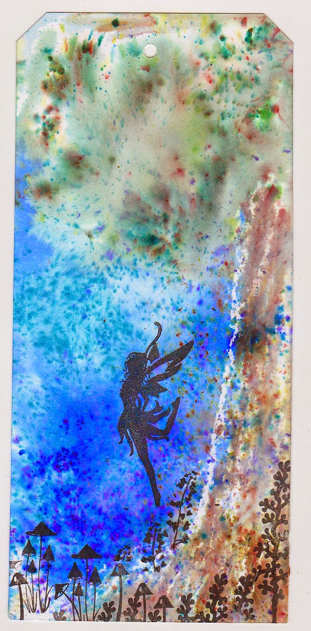
Old brass stencil enlarged 4 times, and cut from card to make the lighthouse using distress inks.  Chocolate Baroque stamps (from 2 mermaid sets). Either stamped with blue archival ink direct to card or distress inks & cut from card.  Small glass vial that's waiting to be half filled with sand, a few pearls, some hessian and gold card.  I photoed this quite late in the afternoon out in the garden, the sun was quite low and has left a whooping shadow of the small glass vial.


My next experiment was to see if you could use brushos as a marbling medium on top of shaving foam.  Lots of youtube vids about the shaving foam technique using all sorts of inks & paints if you want to go have a watch.  In essence though you cover a plate/dish/tray with el cheapo shaving foam, roughly smooth the surface, add a few drops of paint/ink over the top, swirl the colour around using a kebab stick/toothpick, lay the card over the top, press down lightly then lift up and using a flat edge (old credit card/edge of ruler/pastry scraper etc) you drag off the foam to reveal a marbled pattern.  Although shaving foam is a relatively new invention marbling inks is a very, very old technique.

For my experiment I added about an inch of foam to the inside of an a5 plastic container, leveled the surface slightly, and sprinkled 3 colours of brusho.  I wasnt sure what to expect but the grains bloomed so slightly there was next to nothing to see in the way of colour so I gave the surface a good misting of water before swirling the colours around with the end of a crochet hook (I'd used all the kebab sticks at the last bbq) before laying the card on top.  When I pulled the card off rather than just scraping the foam off I sandwiched another piece of card on top the foam and lightly squidged the 2 pieces together until the foam was oozing out the sides, before splitting then scraping the excess off of both.  I did this same card in, squidge with another about 6 or 7 times until there was next to no colour left and I had next to no room to leave any more pieces of card drying.

A few things I found:

Don't go shaking the brushos as though it's a Friday night at the local chippie and the salt cellar is damp.  Little goes an awful long way with these paints.

Each impression gets paler and paler and the coverage less.

Unlike using liquid inks the foam doesn't  get too saturated with colour so the result is never muddy, even if you've been too lazy to change the old foam out when you want to use new colours.

Here are a few scans of one of the first, 3rd and 5th dip in the mix.  Turquoise, gamboge & one of the reds.


Just a couple of cards made using the marbled pieces when dry.  They're not the most imaginitive cards I've ever made.  Technically I might be ok playing with ink but creatively I can't just start with a patterned piece of paper and work from their.  Normally I start with the stamp, then dies & layout before I chose/make my paper to fit the theme.

This one uses woodware teasel stamps, docrafts sentiment stamp, seambinding ribbon and a kaisercraft sparkler. Just like the next card facebook & blogger want to keep turning it on it's side.  Not sure why as both were photoed the right way up and no amount of messing with rotation in psp or copying and pasting to a new image is working.


This one had the foam (a bit that had been more or less unused because it was close to the edge of the dish) dragged across from one edge using a ruler rather than being submerged. Because some of the crystals hadn't been swirled in it left quite pleasing intense effects irl.  Stamp is a heartfelt creations one, stamped onto the marbled card with black archival as well as paper pieced on red stardream using versamark & judikins black embossing powder.  Spellbinders corner and hey ho one finished card even if blogger keeps  rotatating it.


Tims runny distress paint drag technique.

Knowing the brushos worked quite nicely with acrylic paints and they'd marbled well I thought I wonder what they'd do if they were sprinkled over distress paints, misted and the card dragged through.  Some people might be wondering why I bothered when I could just marble but water colour paints are always transparent and when used on coloured card they either distort the colour or lose it all together if the card is dark enough.  A marbley/swirled/messed about effect can be quite effective used on dark card and using a light acrylic paint will allow the brusho colours to appear.

Couple of things to note, 

1, once they've been dragged through a time or 2 the distress paints become muddy so don't go putting loads of paint on the mat thinking you'll be able to get dozens of pieces from it.  Little is best.

2, the pigment in brushos is so intense they will totally overpower and dominate the distress paints if you arent careful.  Treat the brushos as the most fiery chilli powder imaginable and only sprinkle the teeniest amount you can.  Literally a couple of grains of each colour will go a long way.

3, if you think marbling is an unknown effect, this is impossible to even guess at the result you'll get.

4, don't ever throw out the muddy or not so good results, they might not work as a backing design but they're great to stamp flowers/raindrops on and they're fab for when you're diecutting and a flat single colour wont work.

5, I never did get on well with the technique even just using 2 distress paints so don't judge the results by Tims standard.  If you like using this technique try the brushos with it and you'll probably get a far better result than I did.


Here are a few of the pieces I made using the technique, most were too muddy or vibrant to bother showing, that was before I realised they muddied or that I needed a lighter touch.  I used tumbled  glass & spun sugar distress paint as the base.


By the time I got to this and the next one (which was actually made before this one) I'd worked out less is best with brushos on this technique lol  The crafters workshop stencil, peacock feathers distress ink.  Dyan Reavely sentiment, DesignsbyRyn raindrops.  The sentiment and raindrops were stamped on to another pale dragged through piece of card before being cut out.  I could have sworn I had a smallish snowdrop stamp which I'd intended using in the bottom right corner but turns out it's bluebells and wont work with the words.  Once I get hold of one I'll finish the tag and mount it properly on some dark card.


This is the first tag I went to make with previous tags design in mind.  It's a total car crash of a dogs dinner and a good lesson in how to much up a good bit of background then compound things by making it worse and worse.

Originally I'd used grunge paste through the stencil and decided it looked wrong and needed colour.  So I started to add cosmic shimmer gilding wax.. big mistake, I managed to place the stencil slightly off position and didn't get a very good coverage.  Next up I went over with peacock feathers DI and just couldn't get the ink to cover all of the paste.  So I went from bad, to worse to omg what a bloody mess by trying to cover the mistakes with sparkle medium through the stencil.  With the benefit of hindsight I'd have either done the texture paste before dragging the tag through paint, or, would have tinted the medium/used coloured medium.  Seriously gutted because this was my favourite of the dragged pieces and I haven't been able to recreate it.  Ordinarily I wouldn't dream of posting huge booboos like this but oddly just yesterday a friend applied texture paste to a canvas before deciding it needed colouring... if I'd have posted the booboo before she might not have ended up with a similar quandry.. to colour and risk ruin or leave well alone.


That's it for this post, there will be another one but not sure yet what experiments I'm going to do yet, or what time I'll have over the next couple of weeks.